
How we build
Website Design: The Scientific Method
Almost every decision on one of our sites was settled by testing rather than by taste. Here is the evidence, including the parts that argue against how most sites get built.
How we build
We don’t design websites. We build the version that tested better.
Almost every decision on a High Performance Authority Site has been settled by testing rather than by taste. Not a designer’s preference, not ours, and not whatever looked good in a mockup. If somebody has put a thing in front of real users and measured what happened, we build the version that won.
That rules out a whole category of website. We don’t build sites that win graphic design awards. Those are the right answer for a museum or a gallery, where the site is the exhibit. They’re the wrong answer for a service business, where the site has one job and the visitor is in a hurry.
Sites that sell are usually plainer than the ones that win prizes. Almost nothing on them is decorative, and almost everything is there because it survived a test.

That isn’t sour grapes about prizes. Our mobile app division built the interactive app and the iPad kiosks for the King of Roads exhibit at the Barn Museum in Troutdale, the centennial campaign for the Historic Columbia River Highway, and that campaign won the 2016 AMA MAX Award for Best Integrated Campaign. We didn’t build it to win anything. We built it to be worth a visitor’s time on a museum floor, which is a real job with a real user, and the award followed from doing that job properly.
It’s the same standard applied to a different room. A museum visitor has come to look, so the exhibit can be the experience. Somebody searching for a plumber at nine at night hasn’t come to look at anything. Build for the person actually in front of you and the rest takes care of itself.
What the research actually found
Three findings that decide most of the page.
You get about fifty milliseconds
People form an opinion of a website in roughly 0.05 seconds, and that first impression correlates strongly with the judgment they still hold after looking properly. That finding comes from peer-reviewed work published in Behaviour & Information Technology, not from an agency blog.
Fifty milliseconds isn’t enough time to read anything. It’s enough to register whether a page looks like it belongs to a real business and whether it appears to be about the thing that was searched for. So the top of the page has to say who you are, what you do and where you do it, at a size nobody can miss, with a way to get in touch sitting right beside it.
Everything after that serves the visitor who decided to stay.
Carousels and sliders are ignored, and the number is worse than people expect
Notre Dame instrumented the carousel on its own homepage and found that about one percent of visitors clicked anything in it at all, with the overwhelming majority of that one percent hitting only the first slide. The raw click counts are published.
That result isn’t an outlier. Nielsen Norman Group’s usability testing found that automatically moving content gets treated as an advertisement and ignored, and that people who did want to act on a panel were routinely too slow, because it moved before they could reach it. CXL reached the same conclusion from conversion testing.
This is the single biggest disagreement we have with traditional web designers, and it isn’t close. A slider is popular internally because it settles an argument about whose message goes at the top. It settles that argument by showing all of them to almost nobody.
The replacement is duller and works: one clear statement, held still, with the rest of the page organized underneath it. The same applies to video used as a section background.
Speed is a conversion decision, not a technical one
Load time is the one technical measure a visitor experiences directly, and they experience it before they have read a word. Under a couple of seconds and they wait. Past that and a meaningful share never see the page at all, which means every other decision on it stops mattering.
Industry testing puts numbers on that, and they point the same direction: a study on site speed and conversion reports a substantial lift from a single second, and survey data puts the point where visitors start leaving at around two seconds. These are surveys and vendor studies rather than laboratory work, and we treat them as direction rather than as physics. The direction isn’t in dispute.
The ten-second test
Somebody hiring you decides in about ten seconds whether you’re a candidate.
They aren’t reading. They’re checking three things and leaving if any of them is missing.
- Are you the kind of business that does this?
- Do you do it near me?
- Can I contact you now?
So the top of the page carries a big, plain statement of who you are, what you do and where you do it, and a way to get in touch that requires no scrolling and no hunting.
Then, as close to the top as it can go, the proof. For a local business that’s almost always reviews. A rating and a review count near the top of the page does more work than any amount of copy about how much you care, because one is checkable and the other is a claim anybody can type.
The rules we build to
Every one of these came out of testing.
None of it is a house style and none of it is negotiable for aesthetic reasons. If you want one of these changed, the argument that would move us is evidence, not preference.
Non-negotiable, and why
Straight answer
When this isn’t the right call.
If the look is the product
Galleries, restaurants trading on atmosphere, studios selling their own visual taste. There the site is part of the thing being bought, and a different set of rules applies. We’d tell you to hire a designer.
If you want to be proud of it at a conference
These sites are built to be effective rather than admired, and the two aren’t the same target. If the goal is a site that impresses your peers, we’re the wrong people and would rather say so now.
If a slider isn’t negotiable
We’d build almost anything else you asked for. Not that. Putting one back in means knowingly showing your message to about one percent of the people who arrive, and we’d rather lose the job than do it quietly.
Sources
Check any of it.
These aren’t all the same weight and it would be dishonest to present them as if they were. The first two are the strongest: one is peer-reviewed, the other is measured click data published in full. The rest are industry surveys and vendor studies, which are useful for direction and weak as proof. We’ve marked which is which rather than letting a page about scientific rigor lean on a listicle.
Peer-reviewed and measured
Surveys and industry studies, useful for direction
Book a call
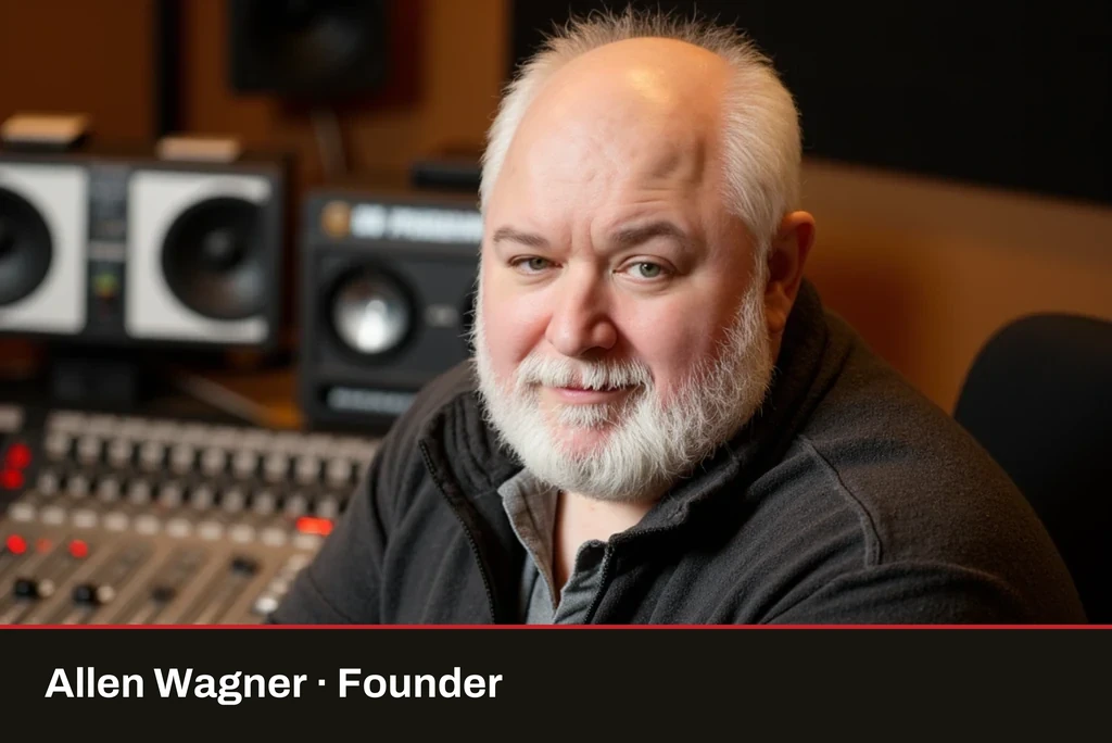
“I'd love to learn about you and your business.”
Ten minutes, and it's mostly me asking what you do, where you do it, and what you've already tried. No pitch deck, no discovery fee, no sales pressure.
Send the form on the rightbelow and I'll set up a call. If we're not a fit I'll tell you right up front and do my best to point you in the right direction.
Call me instead (360) 467-6957